
Designing A
Browser Extension
Read Time: 5-min 〰️️️ Timeframe: 12 Weeks 〰️️️ My Role: Product Design
Tools: User Research (exploratory & evaluative), Iterative Prototyping, Sketch

Context
For a User-Centered Design course, I was tasked with solving the problem of people overspending while online shopping. This problem was discovered from the results of a survey that was given to my class. Students were asked where they feel they overspend the most in their day-to-day lives, and overwhelmingly - it was while online shopping.
My initial assumption of why people might be overspending while online shopping was people are trying to meet the minimum amount of spending required on a given website to receive free shipping. With users trying to meet this minimum, online shoppers are spending more, and potentially exceeding their budget. My assumptions were wrong.
Outcome
I designed a Chrome extension that enables a user to monitor their online spending with customizable filters and alerts. I was designing for a large audience in 12 weeks, which meant I had to rapidly iterate my designs, and implement new solutions based on my usability testing quickly. A successful outcome was achieved through multiple rounds of user interviews and utilizing various UX research methods. Regular user feedback drove the success of this design.
Process
Exploratory Interviews
My assumptions were proven wrong almost immediately after starting my exploratory research. I facilitated 5 in-depth interviews with questions focused on how people spend money online. Each participant walked me through which sites they visit most when shopping and how they feel throughout the process of online shopping, starting with the initial search for a product, up until the package is delivered. I learned people didn’t care about shipping costs and that was not the cause of their overspending. People love receiving packages because it “feels like Christmas.” People tend to make several relatively small purchases, which start to add up financially, and they don’t realize how much until it’s too late (i.e. they’ve overspent for their budget).
After conducting the exploratory research, I found a more clear problem space. I wanted to help people spend money less online by allowing them to pause and reflect during the checkout process, and to take a moment to decide if they actually want to (and can afford to) continue with purchasing said product.
Finding The Target User
The qualitative feedback from the user interviews allowed me to create my first user persona which assisted me throughout the entire design process. Personas are a valuable tool that allows me as a designer to keep the user at the forefront of each iteration.
Journey Mapping
Next, I needed to map out when users started to feel they had overspent and how that made them feel. Based on my exploratory interviews and some light research, I created my first journey map. I was able to see the user’s needs and wants up until the product was delivered. My journey map also provided documentation of users’ pain points and delights within the online shopping experience, which later stimulated my digital solutions.
Ideation
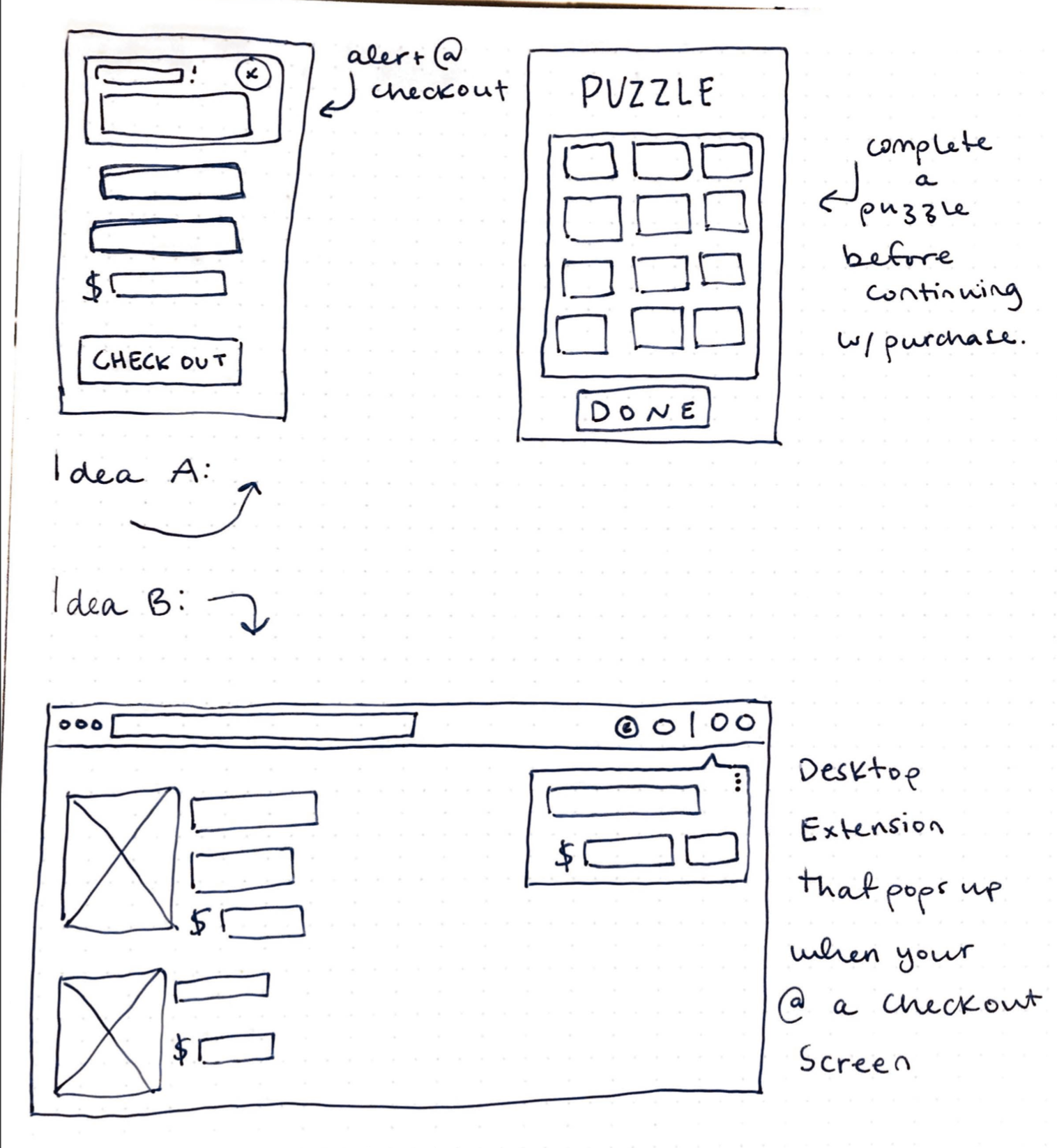
To ideate potential solutions, I sketched several rounds of crazy eights (sketching 8 solutions to a problem in eight minutes). Within my sketches, I found two strong solutions: a puzzle app and a Chrome extension. Each design would help people spend less money while online shopping — but which solution made more sense for my timeframe and feasibility?
ideation sketches round I
I refined my two sketches from my round of crazy eights before moving into a digital mock-up. Sketching allows me to sort through the good, the bad, and the ugly quickly, while also allowing me to communicate my designs to stakeholders and the team more rapidly than I would be able to with a digital wireframe.
Solution 1: A Puzzle App
If a user wanted to make an online purchase (on mobile), my puzzle app would require the user to open the app first and complete a puzzle before continuing on with their purchase, and only after completing the puzzle, the user can decide if they want to continue with the transaction or not.
Usability Testing:
I had 5 participants test this prototype. I was given overwhelming feedback that the fake puzzle was blocking their understanding of how the app would work. If I wanted to continue with this solution, I would have had to add ‘puzzle creator to my toolbox fast.

Solution 2: A Chrome Extension
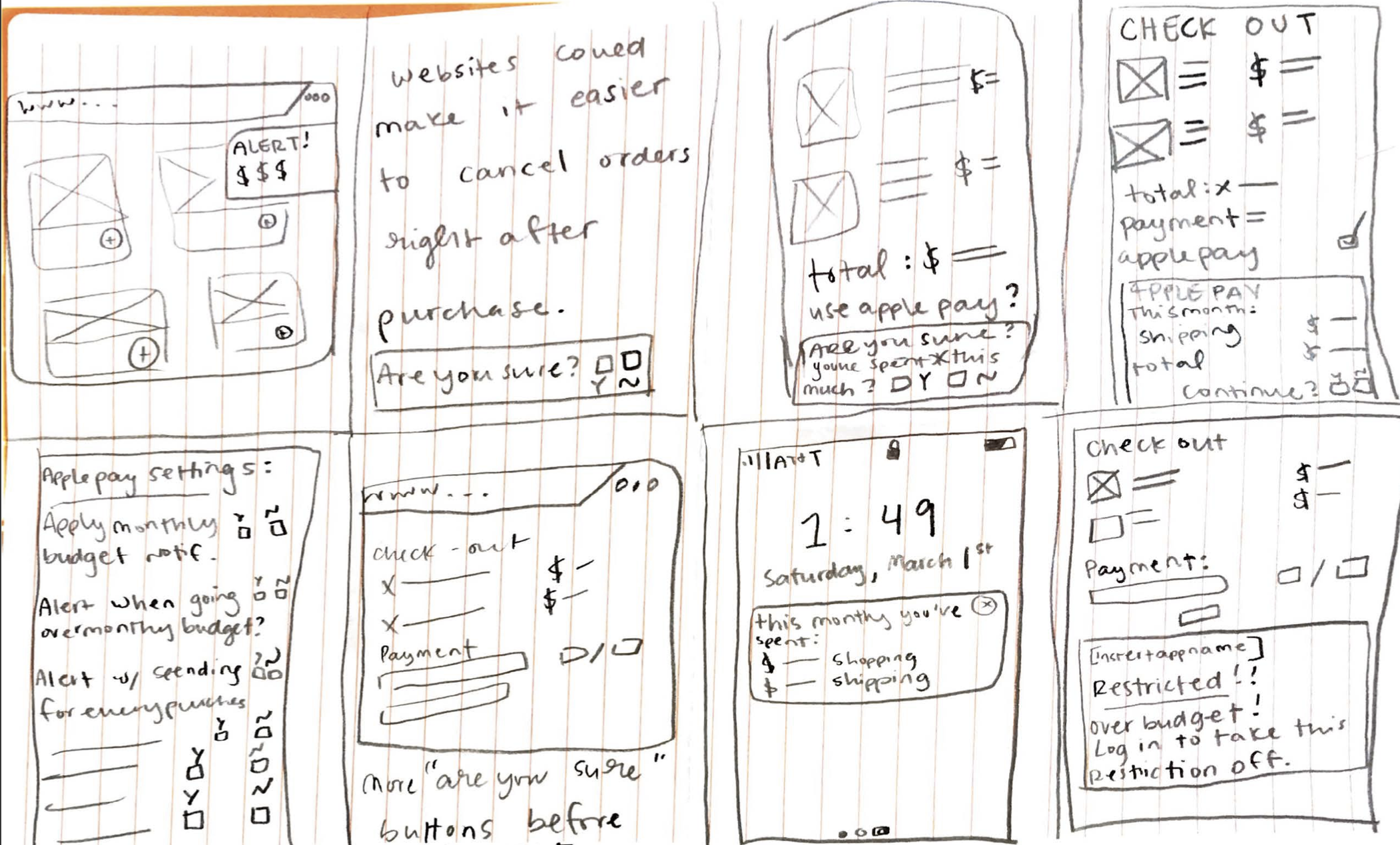
My Chrome extension solution would provide notifications to users while they are online shopping. The notification would remind the user of their saving goals and would also have the ability to monitor how much the user was spending online. The notification would only appear based on the user’s preferences in the extension settings.
Usability Testing:
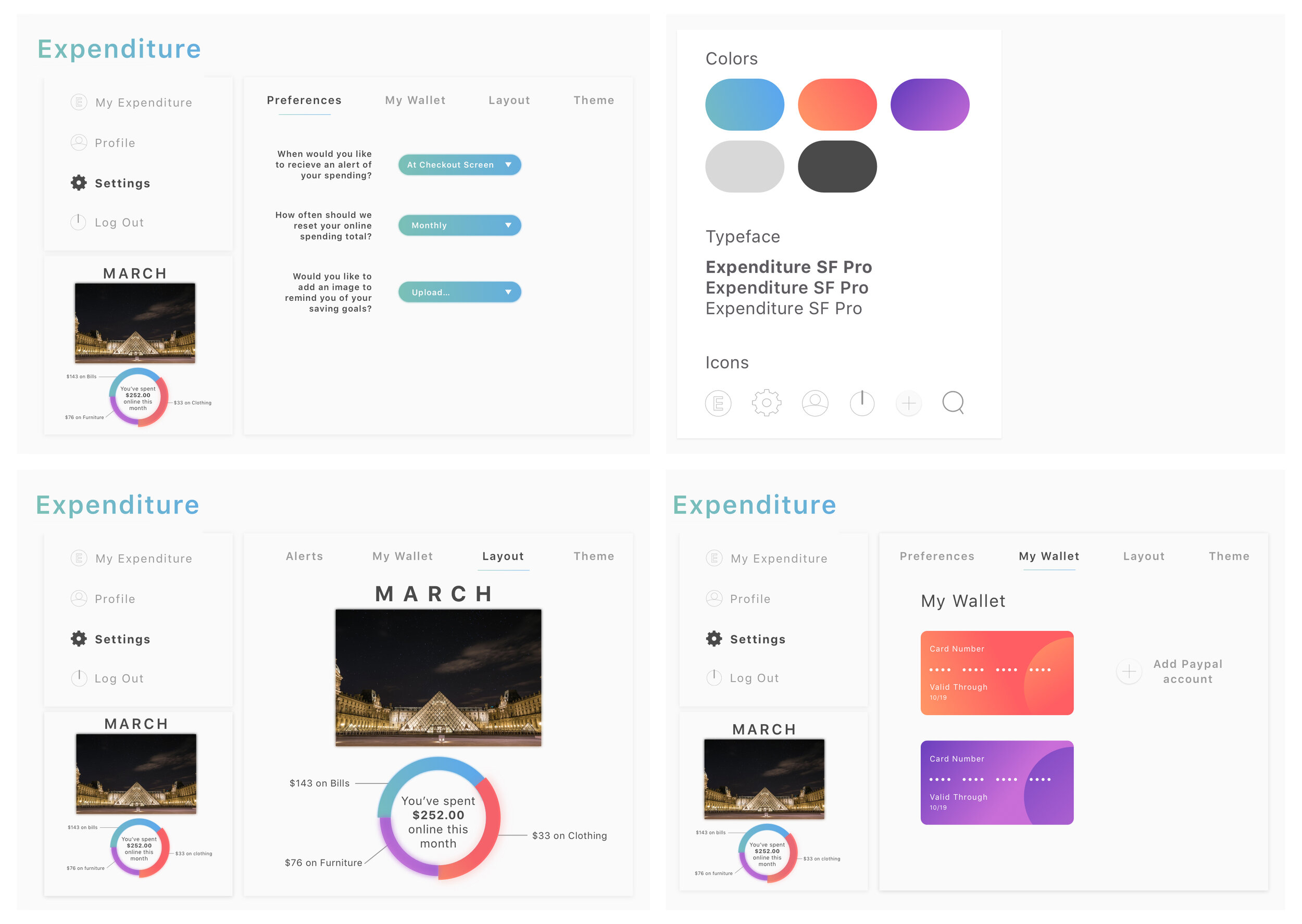
Testing for the extension included five tasks and each task took place in curating the settings for the extension. Users were asked to select when the notification would appear, how often the notification should reset the total of users' online spending, and if they wanted to include a photo to remind them of their saving goals.

Each usability test session positioned the user to interact and explore the app and/or extension I prototyped using InVision. Testing prompted me to move forward with the Chrome extension.
Iteration
Moving forward with the Chrome extension
I knew in my next iteration I wanted to include plenty of customization.
I then tested if the added functionalities worked for users by conducting a series of small usability tests. I interviewed four new, and two returning users. I conducted the tests using a Figma prototype and gave them three tasks to perform.
Key Usability Test Insights:
I needed to add more data visualizations for displaying their spending.
Several users did not understand why adding an image was an option.
Two users were not clear where they were within the settings.
Users wanted to see a more clear preview of the notification.
Second Iteration
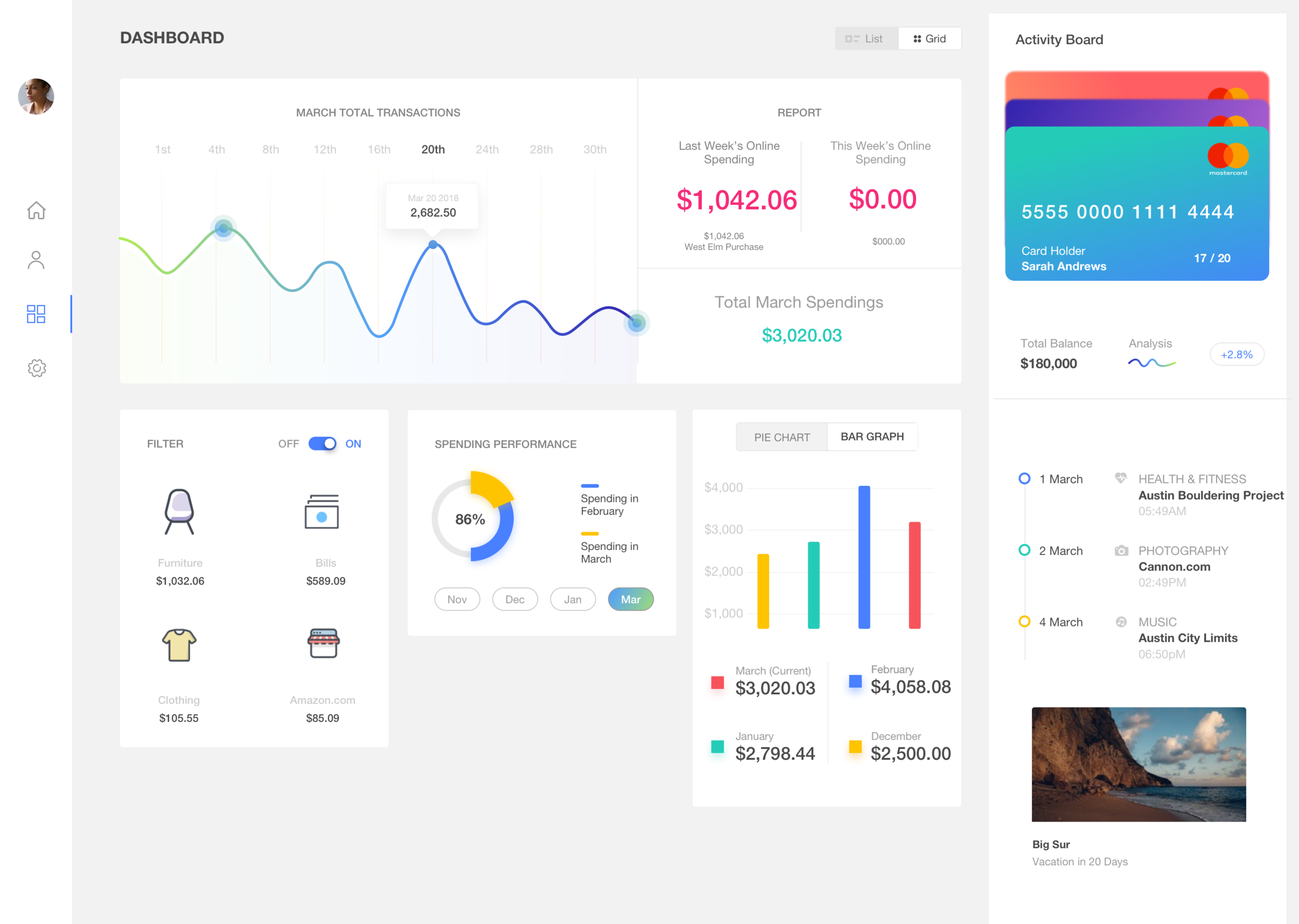
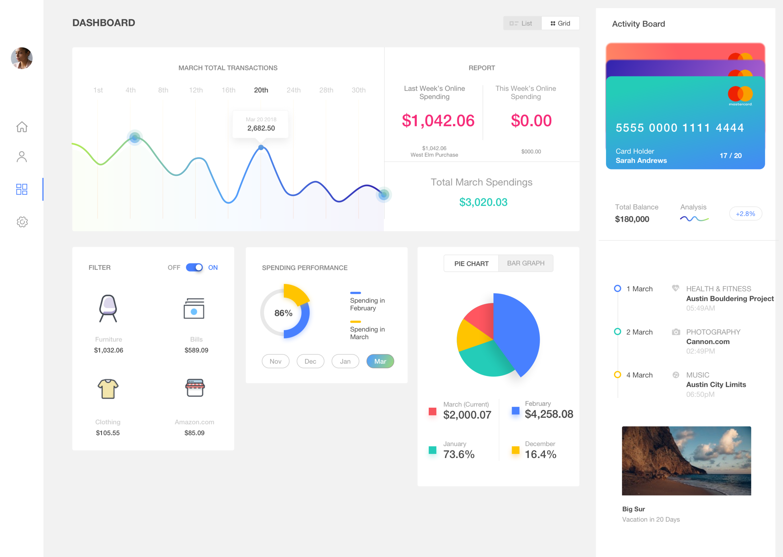
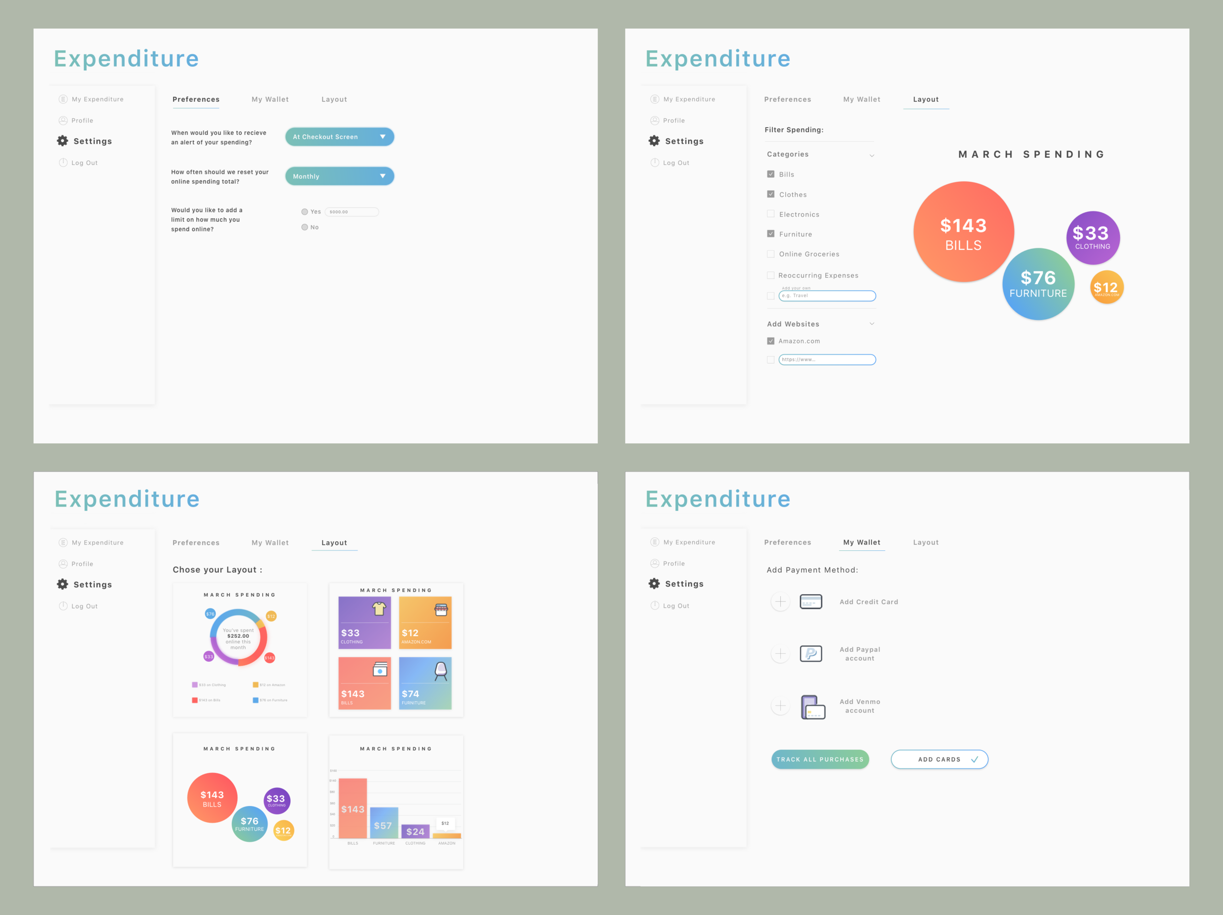
The usability tests showed I needed to decrease the number of pages the user had to go through. In this iteration, I worked on eliminating unnecessary features; I trashed the initial design of the total spending data visualization with four new designs that would hopefully be more clear. I added new filters, a preview of the notification, and I created new visuals to display a user’s total spending, which also separated and organized types of purchases.
I proceeded to conduct more small usability tests with five new users who had not yet seen the extension.
Key Usability Test Insights:
Once again, I received the feedback that I still wasn’t using enough visuals to display the user spending habits.
Rather than requiring the user to choose their preferred data visualizations that would display their spending, users wanted to see all of the data visualizations, always.
Users were still confused about where they were in the extension.
Prototype
Final Iteration
The final product included eight different visuals to display the user’s spending and a more clear set of iconography. I changed the layout entirely to show all settings on one page, and a dashboard to display all visuals.
This eased the burden on the user by decreasing the number of clicks and navigating multiple pages.
Reflections & Learnings…
Users want to manage their finances and save money, but they need a tool that’s easy to navigate with as few steps as possible. Looking back, I gained valuable insight into the diversity within the way people handle finances in terms of saving, spending, and managing multiple accounts.
My next steps for Expenditure would be to design a mockup of the check-out scenario and test the extension based on settings chosen by each user. My design was successful because I deep-dived into user research and conducted countless usability tests which allowed me to design for the right problems.